Monday, January 4, 2010

Reflecting on self-portrait progress

In my self portrait my face is filled with different sections of drawings that have to do with my passions and important things in my life. My hair is a collage of pictures that show my family and friends and basically my life. During my groups discussion they suggested the idea of painting or coloring the background of my face skin color to more specifically translate the fact that it is supposed to resemble my face. My group liked my project and thought that it was overall very creative. I am almost done with my self-portrait, basically all I have to do now is just color in.

Tuesday, December 1, 2009

Why do people make art?

Why do people make art? A better question is why wouldn't they? Art is a hidden message, a map, your emotions on paper. Art is a stress reliever, a time consumer, a talent, a passion, a profession, and a hobby. Each person might have a different reason as to why they make art. These things that I have listed above all are reasons. If your having a bad day art is a safe way to relax you and make you feel better. In the beginning of time they didn't know what was going on outside with the animals and the only way to understand was by drawing with the resources given. In this case art gives the people an answer. There's no correct explanation to this question because every person you ask will give you a different answer. I personally, love art because of the satisfaction you get when you draw something that looks good and the way the clay feels going around the wheel in ceramics. Overall its the passion and the love of art which is why people in fact make it.

Thursday, November 19, 2009

Reflecting on the Four Hour Project

This project is very different then all of the others that we have been working on throughout the first term. This project has showed me how much I've learned throughout this term because I created something that shows my knowledge and understanding of the principles of design. This is because, my project was explaining a story and the back round was black, blue, and red. These colors emphasize sadness which was the main theme of my story. The hardest part of my project was creating leading lines to explain the story. I finally figured out that I needed a background to show the theme and then emphasize my main picture which was of a hand with a picture of a little boy. I then made a road going to a house. This symbolizes the fact that they are trying to find the boy who was kidnapped and take him home. The street shows proportion and the emotion that shows he's so far away from the house and wants to come back home. Along the way I have improved my project and my understanding of principles of design.

Monday, November 9, 2009

The Book Project...progress and planning

My original plans for my book project are the same as they are now. My story is trying to show a young women trying to buy a house for her and her husband to start their lives off. I have been following my sketchbook drawings for the most part. The only thing that I have really changed throughout my book so far is the emphasis. On the second page I totally changed it. The picture used to be the realtor and the woman meeting at the door but now there is a big hand in the background and the realtor is huge in comparison with the woman. This emphasis shows that the future of the woman is in the realtors hands. It is hard to make each picture very different while including things like leading lines. Overall the process is going well but it has been taking longer than I thought.

Thursday, November 5, 2009

Drawing the Human Figure From the Inside Out

The goals for today's drop everything and draw were to draw humans from the waist and down and up. There was a lot of scribbling used in this activity and everything connected together in a certain way. Another goal for today was to not listen to what your brain was telling you to do. For example, if someone was lying down that didn't necessarily mean that you had to turn your paper around unless that's what you actually saw. I think I achieved my goals pretty well but I have to work on not listening to what my brain was telling me to do. I was drawing Alex who was lying down and I flipped my paper around because I was at side view and that's what I saw. When drawing both Sophia and Taylor I could only see the back of their heads. This was harder for me because I didn't fully know how to create the arm without putting the arm legitimately in the middle of the back.

Thursday, October 29, 2009

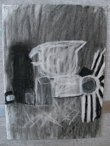
Shades of gray

Today in class we made charcoal drawings using different shades of gray. The goals were to make it so you could tell what everything was, have 5 different shades of gray, and make it look realistic. I think I achieved this goals pretty well. I right away got to work on different shades of gray which I like a lot because it helped show whether the object was light or dark or in between. What was hard for me was drawing a certain handle from a pitcher it wouldn't fit right and I was making it with an eraser which didn't give great curves. This was a very big challenge for me. Also, we were to make things bold and make it look like they were actually hard or made of ceramics if they were which I think I showed in my drawing as well. Overall I think I achieved all of the goals from this weeks drop everything and draw day.

Monday, October 26, 2009

Studying Nighthawks


Nighthawks
by Edward Hopper, Edward Hopper is from America.
Made in 1942
Oil on canvas was used to make the work.

My first impression of this painting was that it was a very regular picture. When I say this I mean that it looks like just a regular day with dark colors and no bright colors. There is no one outside of the diner which shows loneliness and that there are only a few people alone in a big world.

Edward Hopper was trained to be an illustrator but spent five years studying painting which influenced his style to become about urban isolation. He made this painting to show a diner and three customers that are all in their own private thoughts. Without even knowing it Hopper actually painted the loneliness of a large city.

Edward Hopper shows asymmetry in his painting. There isn't any balance in this picture because there are more objects on the right side of the painting. The emphasis is on the four people. They are alone in the diner and it shows placement. They are in the center of the picture and you right away start to wander what each person is doing, thinking, and who they are. This placement emphasis helps you think and they are the first thing you see when looking at this picture. There also are leading lines in this picture. The leading lines take you up the street, down the sidewalk, into the diner and then down the table. I can tell these are leading lines because that was the path my eyes took me on when I first looked at the picture.