Tuesday, December 1, 2009

Why do people make art?

Why do people make art? A better question is why wouldn't they? Art is a hidden message, a map, your emotions on paper. Art is a stress reliever, a time consumer, a talent, a passion, a profession, and a hobby. Each person might have a different reason as to why they make art. These things that I have listed above all are reasons. If your having a bad day art is a safe way to relax you and make you feel better. In the beginning of time they didn't know what was going on outside with the animals and the only way to understand was by drawing with the resources given. In this case art gives the people an answer. There's no correct explanation to this question because every person you ask will give you a different answer. I personally, love art because of the satisfaction you get when you draw something that looks good and the way the clay feels going around the wheel in ceramics. Overall its the passion and the love of art which is why people in fact make it.

Thursday, November 19, 2009

Reflecting on the Four Hour Project

This project is very different then all of the others that we have been working on throughout the first term. This project has showed me how much I've learned throughout this term because I created something that shows my knowledge and understanding of the principles of design. This is because, my project was explaining a story and the back round was black, blue, and red. These colors emphasize sadness which was the main theme of my story. The hardest part of my project was creating leading lines to explain the story. I finally figured out that I needed a background to show the theme and then emphasize my main picture which was of a hand with a picture of a little boy. I then made a road going to a house. This symbolizes the fact that they are trying to find the boy who was kidnapped and take him home. The street shows proportion and the emotion that shows he's so far away from the house and wants to come back home. Along the way I have improved my project and my understanding of principles of design.

Monday, November 9, 2009

The Book Project...progress and planning

My original plans for my book project are the same as they are now. My story is trying to show a young women trying to buy a house for her and her husband to start their lives off. I have been following my sketchbook drawings for the most part. The only thing that I have really changed throughout my book so far is the emphasis. On the second page I totally changed it. The picture used to be the realtor and the woman meeting at the door but now there is a big hand in the background and the realtor is huge in comparison with the woman. This emphasis shows that the future of the woman is in the realtors hands. It is hard to make each picture very different while including things like leading lines. Overall the process is going well but it has been taking longer than I thought.

Thursday, November 5, 2009

Drawing the Human Figure From the Inside Out

The goals for today's drop everything and draw were to draw humans from the waist and down and up. There was a lot of scribbling used in this activity and everything connected together in a certain way. Another goal for today was to not listen to what your brain was telling you to do. For example, if someone was lying down that didn't necessarily mean that you had to turn your paper around unless that's what you actually saw. I think I achieved my goals pretty well but I have to work on not listening to what my brain was telling me to do. I was drawing Alex who was lying down and I flipped my paper around because I was at side view and that's what I saw. When drawing both Sophia and Taylor I could only see the back of their heads. This was harder for me because I didn't fully know how to create the arm without putting the arm legitimately in the middle of the back.

Thursday, October 29, 2009

Shades of gray

Today in class we made charcoal drawings using different shades of gray. The goals were to make it so you could tell what everything was, have 5 different shades of gray, and make it look realistic. I think I achieved this goals pretty well. I right away got to work on different shades of gray which I like a lot because it helped show whether the object was light or dark or in between. What was hard for me was drawing a certain handle from a pitcher it wouldn't fit right and I was making it with an eraser which didn't give great curves. This was a very big challenge for me. Also, we were to make things bold and make it look like they were actually hard or made of ceramics if they were which I think I showed in my drawing as well. Overall I think I achieved all of the goals from this weeks drop everything and draw day.

Monday, October 26, 2009

Studying Nighthawks


Nighthawks
by Edward Hopper, Edward Hopper is from America.
Made in 1942
Oil on canvas was used to make the work.

My first impression of this painting was that it was a very regular picture. When I say this I mean that it looks like just a regular day with dark colors and no bright colors. There is no one outside of the diner which shows loneliness and that there are only a few people alone in a big world.

Edward Hopper was trained to be an illustrator but spent five years studying painting which influenced his style to become about urban isolation. He made this painting to show a diner and three customers that are all in their own private thoughts. Without even knowing it Hopper actually painted the loneliness of a large city.

Edward Hopper shows asymmetry in his painting. There isn't any balance in this picture because there are more objects on the right side of the painting. The emphasis is on the four people. They are alone in the diner and it shows placement. They are in the center of the picture and you right away start to wander what each person is doing, thinking, and who they are. This placement emphasis helps you think and they are the first thing you see when looking at this picture. There also are leading lines in this picture. The leading lines take you up the street, down the sidewalk, into the diner and then down the table. I can tell these are leading lines because that was the path my eyes took me on when I first looked at the picture.

Wednesday, October 21, 2009

Finding images that are balanced

Symmetrical Balance


Approximately Symmetrical Balance


Radial Balance


Asymmetrical Balance


Tuesday, October 20, 2009

The Principles of Design

Principles of design: this set of rules that help artists from whatever they are working on
vocab
Balance: when the visual "weight" of an an artwork feels equally distributed
-symmetry
mirror image
-approximately symmetrical
almost mirror image feeling of symmetry
-asymmetry
opposite of symmetric yet still could be balanced
-radial balance
coming out from the middle (circular) infinite lines of symmetry
Emphasis:
rhythm and movement:
proportion:
unity: feeling that everything works together, if something was missing it would be incomplete
variety: having some differences in shapes, colors, forms, order, etc.

Emphasis
-When one element in an artwork appears to be more important or attract the most attention, we say it creates EMPHASIS.
Placement-Where Artists put stuff matters sometimes in the middle or not but always thinking about where it goes.
Contrast-something that is very different then what's around it could be color, shape,etc.
Grouping- When Artists decides to take a bunch of elements and put them right around the thing that they want to emphasize is grouping.

Rhythm and Movement -referring to how the artist guides the viewer through a work of art do it by:
-repetition
-same elements
-alternating elements-ex. color pattern
-progression-element is repeated but changing getting ex. getting smaller

-leading lines-Lines that help us travel through the painting.
-implied movement- Looks like it's moving by positioning of other parts of the picture or sculpture.
-optical movement-When you repeat some line or shape and there's an illusion it makes your eye feel like it's moving.
-actual movement- Where art actually moves

Proportion- In art we are talking about the size relationship of the parts to one another or to the whole.
Colors- Can put a lot of red in and emphasize it by contrast.
Shapes-
Forms-
We might use words like a lot, a little, many, few, big, small, similar, etc.


Monday, October 19, 2009

Reflecting on Found Object Sculpture


I started my found object sculpture by taking the chains off of my moms old shoes. This pretty much is what inspired me to start my sculpture. I thought that together the two chains looked like a body. I then took two plastic pieces from sunglasses and noticed it looked like a butterfly. I didn't know what to use for wings at first. My plan in my sketch book was to create a tree for the butterfly to be on. Which is when the flower pedals came in to use. I noticed that it looked more like wings and kept adding more and more making it very colorful just like a butterfly. The best part of the two chains was that I got to use a wire to tie it together making it look even more like a body. Once I noticed this my mind was set and pushed me to want and to ultimately complete my sculpture of a butterfly. During the scavenger hunt I noticed how much people overall influence art. Half or even more of the sculptures were of people or animals. This shows how natural it is for us all to take what we see every day and apply it to art. I really like how my sculpture hangs but if I could go back and do it all differently I probably would have been more strategic when it came to putting the flower pedals down as the wings to make it look a little more neat looking.

Reflecting at mid-term

So far in this term I have progressed by having a better attitude toward creating art in general. I easily become uncomfortable with my art because I'm not great at things like drawing. I have learned to embrace my creativity which I do have and just try my best to show what I can do. I'm good about doing all my homework and blogs thoughtfully and on time. During the line story collage in particular I got really into it and created this story from a song I was listening to that inspired me. This project helped open up my mind and show me how much fun art really is. I liked taking pictures from magazines and creating different emotions through lines which was really interesting to me. Lastly, on drop everything and draw days with charcoal, helped work on my focus and drawing still life. I wasn't afraid to get messy or erase what I had already drawn. As you can see, I have progressed a great amount so far this term but I definitely have much more to work on and learn throughout the rest of this course.

Thursday, October 15, 2009

What's in the Sack?

The goals for today's drawings were to create shapes out of the bags to make them look different to show whether there's liquid in it or something hard and to represent the object. For the what I believe to be a big bag of water, I shaped it so that it was not proportioned and an odd and circular shape. For the bag with the box in it I made it so that there were straight and pointy edges to show what I was trying to create. Another goal for today was to make the shadows. This was a little difficult at first, because I made the shadows dark instead of the background. Since I did this I had to go back and fix it to make the shadows lighter. One last goal was to at first go quickly and look at the still objects more then the painting. This was a little hard for me as well because I liked perfecting little things which I learned not to do during this process. These were the goals for today's drawing.

Thursday, October 8, 2009

The changing still life

In order to keep up with the changing still life I had to keep my eyes on the set up almost the whole time. Also, I had to not worry as much about whether my drawing looked good and neat but more about getting all of the objects onto my paper. Lastly, I didn't really carefully draw anything I mostly just drew the obvious and didn't perfect each little thing because if I had then I would have gotten behind. When I was erasing I had to go really fast which made my drawing really messy and dirty which I truly only noticed afterwards because I was paying attention to the changing still life.

Tuesday, October 6, 2009

The Potential of Found Objects

Each sculpture shown on the class blog are made from different raw material/objects. In the dog sculpture they added ears which look a little bit like a post from a lamp. They are floppy so it helps create the vision of a dog. The artists chose the objects they did because they all bring something different to the table. Different shapes can turn into pieces of an object by fitting together almost like a puzzle in 3D form. Big objects like a big empty water jug which is in one of the sculptures is a great base to start the sculpture.

Monday, October 5, 2009

Reflecting on my first critique

My artwork was very in depth and creative to a point where it was hard to figure out what was going on unless you actually knew what it was about. My negative feedback was that I should have used darker colors to show more sadness. I really like bright colors so I couldn't help but use colors I liked even though it didn't match the theme of my picture. My positive feedback was that I definitely thought about the story. Getting feedback from my classmates was fine. It made me think a little bit more about my painting and what I need to work on in the coming projects.

Friday, October 2, 2009

The Work of Ingrid Calame

These pieces of artwork don't look like anything I've ever seen before. They all are so unique and make you have a different view. You can't just look at it and that's all there is so much more to each painting then meets the eye at first glance. Ingrid Calame is an artist who tries to represent the world and the things that we forget about or don't notice through artwork. Her process is that she goes on to the street, traces marks and stains on the street, goes back to the studio pieces them together and then mixes different colors and shades of paint and just paints the piece different colors.


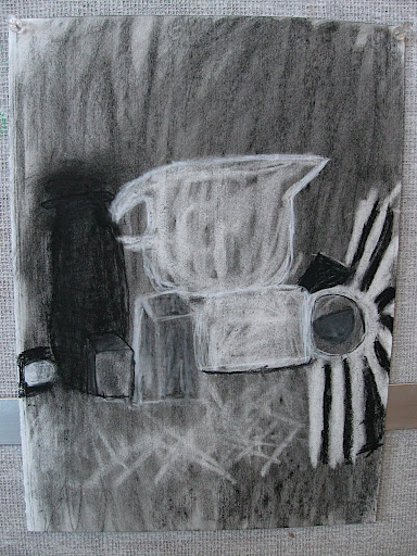
This is one of Ingrid Calame's paintings. I really appreciate this painting because it is very colorful and puts colors together that you would never think about putting together. Also, they aren't just straight lines. She doesn't paint in the lines which I really like too.


Thursday, September 24, 2009

What we've done in art principles class over the past week and a half

All these activities have creativity in common. This is because, for the postcard project you have to use your imagination to find different ways to explain what's going on in the picture without actually saying what's "in" the picture. In the collaborative drawing we had to continue someone else's drawing which is very challenging but put our creativity to work. The pour paintings went from a spot of paint to a total different figure. Lastly, we did the mapping of still life which was incredibly hard. It takes a lot of creativity and thought to figure out how to draw something without actually drawing it. That sounds so weird but actually what we had to do. As you can see when it all comes down to it we put our imagination and creativity to work for the past week and a half.

Re-visiting observation/description activity

She got the triangle in the left corner right and the big red square in the middle. She missed the letters and most of the colors. She drew a pizza box it looks like but thats not what it was at all. If I were to do this project again I think that I would be much more descriptive when it came to the colors and shapes on top of shapes and the patterns that evolved throughout the picture.

Wednesday, September 23, 2009

What I see in my painting

1) A boomarang

2) A frog

3) Maisy the mouse

4) Porcupine

5) Snow flakes

6) a figure 2

Tuesday, September 22, 2009

Giving up control: POURS

The process of creating paintings through pouring paint was actually more relaxing. I like not knowing what was going to happen. Sometimes a painting would come out absolutely disgusting all chunky and colors mixing badly. Only, there were times where the paintings came out great. In one of the paintings without trying stripes appeared and there was silver in the painting. You never know what you will find which makes these kinds of paintings much more exciting and creative overall. When I didn't have any control over the shapes I became more into the drawing.

Monday, September 21, 2009

collaborative drawing

In class today we did collaborative drawings. I thought that it was really funny seeing my end result. When other people worked on my drawing it totally transformed. When I started it, I was thinking about making the penguin we were given diving off of a waterfall. When I came back after everyone had worked on my drawing it had become a ski resort. There was hot chocolate and skis. I had to use white paint to cover up the skis and hot chocolate and create a bubble that said splash so people would hopefully get a better idea as to what was going on. This exercise has helped me learn to make my drawings more specific so that people know what I have drawn.

Friday, September 18, 2009

What makes someone an artist?

1) An artist is someone who is creative and loves to create whether it’s art, poetry, or writing. Anyone can be an artist if they have the heart to commit to it.

2) To be creative is to let your thoughts flow and find new ways to make things exciting. Creativity is to be different and more interesting.

3) In order for an artist to be creative and productive they need to have inspiration. For example, an object they want to draw. Also they need to have a quite spot where they can let themselves breathe and just think about art. Lastly an artist needs to have supplies like paper, canvas, pencils, paints, and so on.

Monday, September 14, 2009

Evening Dress

objectview_altviewzoom.aspx.jpg

Dress, Evening

This dress was made in 1958

By Madame Grès

French, Made in Paris


First Impressions: To me this dress is very calm and elegant and not too busy.


What I've learned: I have learned that this dress was made out of silk and it was a gift of Mrs. Leon L. Roos.